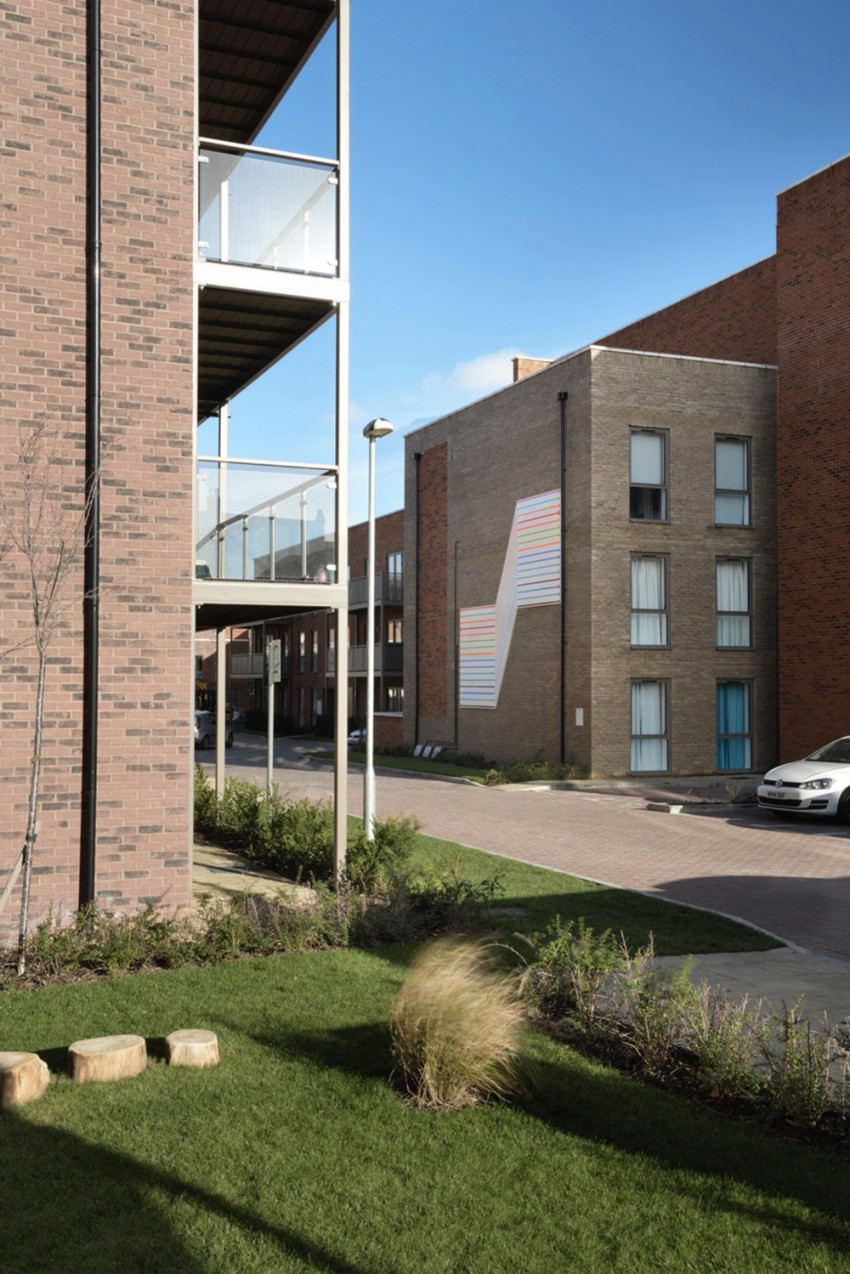
Tom Pearman was commissioned to create a large-scale public artwork for a residential development in Croydon, located on the site of the former Addiscombe Road Station.
The project draws on the visual language of London’s rail and tram networks and the idea of moving along a line, transforming familiar transport graphics into a bold architectural artwork for the development.
Folding Train Map
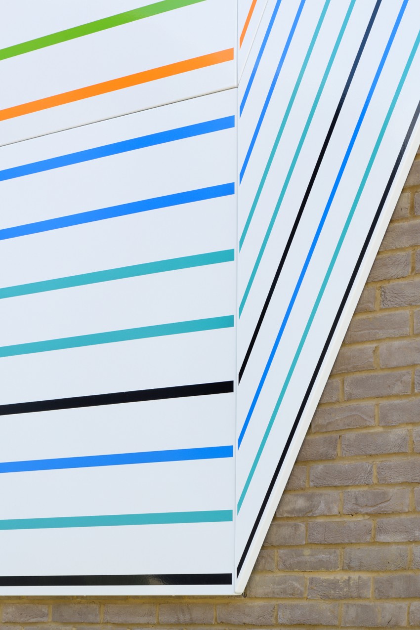
The composition takes inspiration from the familiar form of a folding railway map.
Parallel coloured lines move across the façade before sharply changing direction, creating the impression that the surface itself is folding or bending. The resulting form sits somewhere between a map, an architectural drawing and an abstract geometric sculpture.
The artwork uses colours and symbols associated with London transport networks, while remaining deliberately abstract rather than reproducing a specific route map.
Rail heritage
The project responds directly to the history of the site and its former relationship with the railway.
Addiscombe Station once occupied the development site, and the artwork provides a contemporary reference to this transport history without using conventional heritage imagery.
Instead, the visual language of rail travel — routes, lines, stops, movement and directional symbols — becomes the basis for the artwork itself.
Material and fabrication
The artwork was fabricated in vitreous enamel on steel, the same durable material traditionally associated with signage across London’s rail and Underground networks.
Using vitreous enamel therefore provides both a practical architectural finish and a direct material connection to the transport infrastructure referenced by the work.
The crisp coloured lines and white background reinforce the appearance of transport graphics while allowing the artwork to read clearly at the scale of the building.
Identity and architecture
Located on a prominent external wall, the artwork creates a strong visual identity for the development.
Its large folded form responds directly to the architecture, while the repeated parallel lines create a sense of movement across the façade.
The project also incorporated a graphic language influenced by the period of significant railway and infrastructure development in Croydon, including references to historic transport typography and signage.
Project communication
The folding-map concept was also extended into a printed flyer distributed to local residents, introducing the project and its relationship to the history of the site.
This allowed the graphic identity of the permanent artwork to continue into the project’s printed communication.
Project feedback
“Thank you for your design and imagination – I too think this was a very successful partnership!”
— Technical Director, Bellway Homes Ltd (South London)
–

–